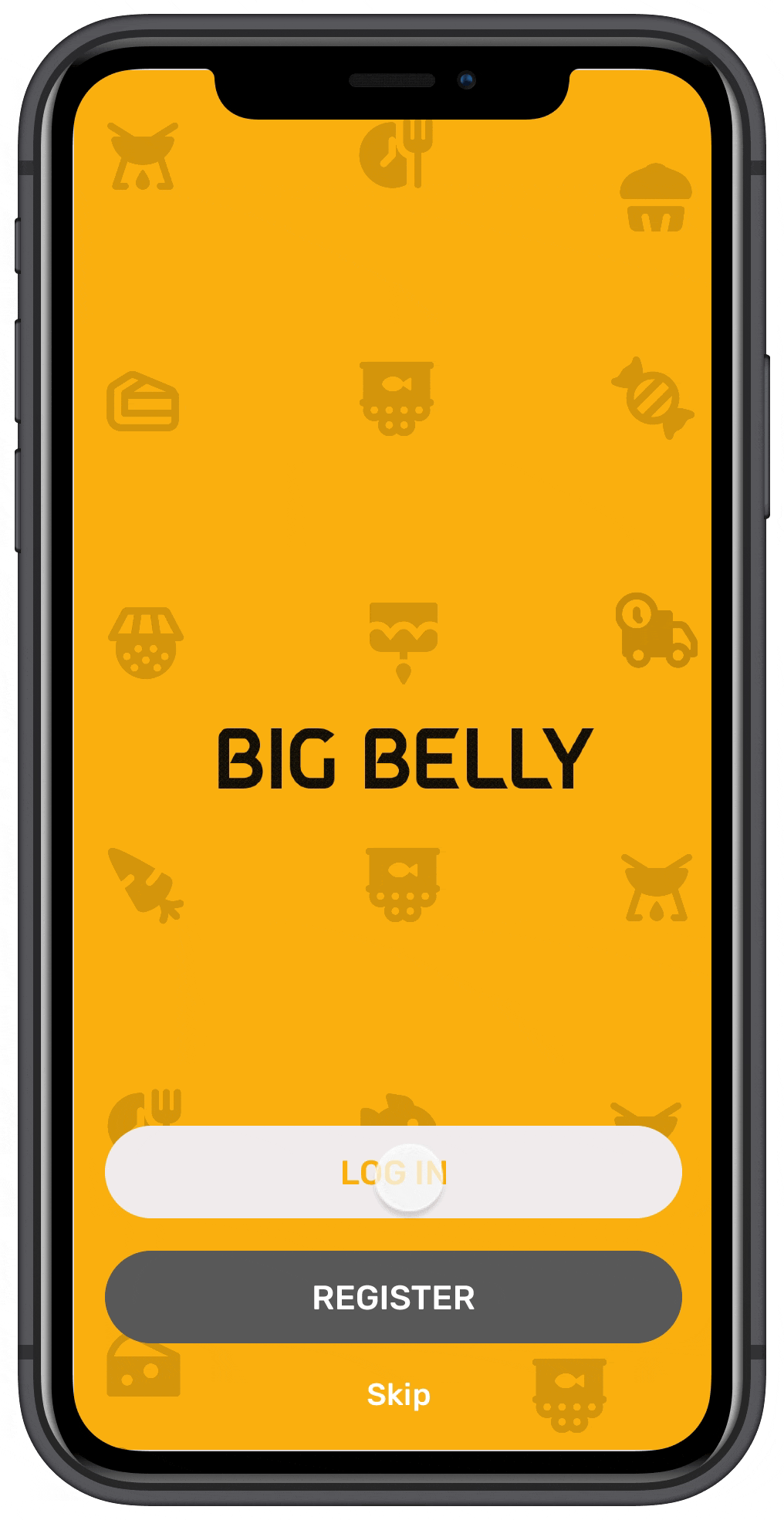
The product:
Dedicated to providing incredible food at incredible prices. Their menu boasts a variety of sensational dishes built around fresh, seasonal produce and has customers coming back on a daily basis.
Project Overview
The problem
Busy workers and commuters lack the time necessary to prepare a meal.
The goal
Design an app for Big Belly that allows users to easily order dishes.
My role
UX designer designing an app for Big Belly restaurant from conception to delivery.
Responsibilities:
Conducting interviews, paper and digital wireframing, low and high-fidelity prototyping, conducting usability studies, accounting for accessibility, and iterating on designs.
User research: summary
I conducted interviews and created empathy maps to understand the users I’m designing for and their needs. A primary user group identified through research was working adults who don’t have time to cook meals.
This user group confirmed initial assumptions about Big Belly customers, but research also revealed that time was not the only factor limiting users from cooking at home. Other user problems included obligations, interests, or challenges that make it difficult to cook or go to restaurants in person.
Understanding the user
User research: pain points
Working adults are too busy to spend time on meal prep
no way to see the previous order
Not enough details about items for comparison
Persona: Anna
A busy working adult who needs a quick and easy way to order from her favourite restaurant after a long day.

User journey map
Mapping Anna’s user journey revealed how helpful it would be for users to have access to a dedicated Big belly app.
Persona: Anna
Goal: an easy and faster way to order food

Paper wireframes
Taking the time to draft iterations of each screen of the app on paper ensured that the elements that made it to digital wireframes would be well-suited to address user pain points. For the home screen, I prioritized a quick and easy ordering process to help users save time.
Starting the design
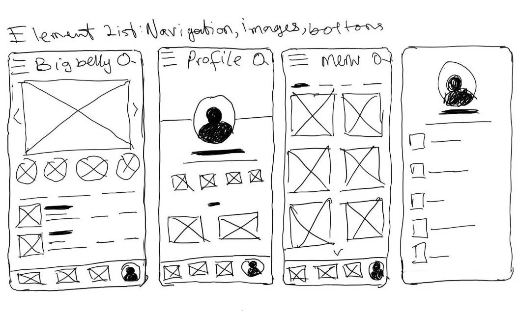
Digital wireframes
As the initial design phase continued, I made sure to base screen designs on feedback and findings from the user research.
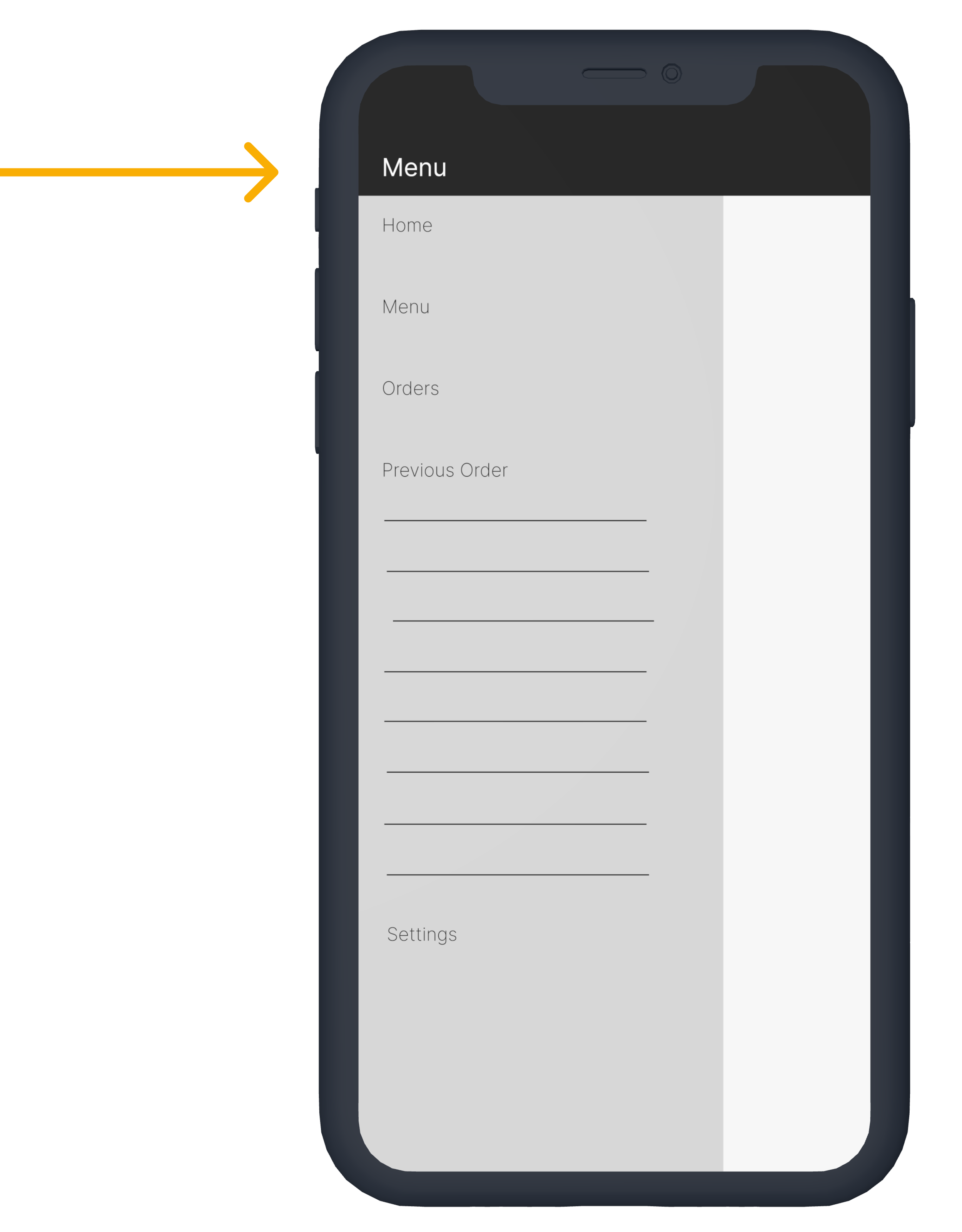
These options at the top of the home screen makes it easier for users to see popular and previous order

Easy access to navigation that’s screen reader friendly.
This button provides an easy option to add items to the basket.
Digital wireframes
Easy navigation was a key user need to address in the designs in addition to equipping the app to work with assistive technologies

Low-fidelity prototype
Using the completed set of digital wireframes, I created a low-fidelity prototype. The primary user flow I connected was building and ordering, so the prototype could be used in a usability study.
View the Big Belly
low-fidelity prototype
Usability study: findings
I conducted two rounds of usability studies. Findings from the first study helped guide the designs from wireframes to mockups. The second study used a high-fidelity prototype and revealed what aspects of the mockups needed refining.
Round 1 findings
Users want to order food quickly.
Users want more details about food.
Users want a navigation interface option.
Round 2 findings
The checkout process has too many unnecessary steps.
Mockups:
Usability study 1: Early designs allowed for some options to quickly add items to the basket, but after the usability studies, I added additional options. I also revised the design so users see more options when they first land on the home screen.
Refining the design


Mockups:
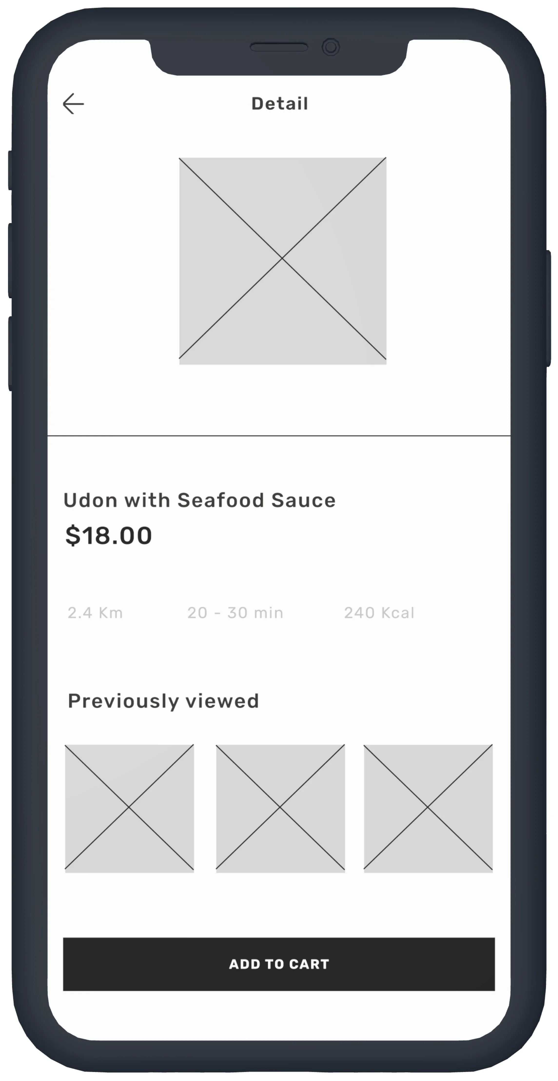
Usability study 2: The second usability study revealed frustration of not being able see descriptions about items for comparison, so I added a little summary about the item. I also added the quantity option.
Key Mockups


High-fidelity prototype:
The final high-fidelity prototype presented cleaner user flows for building a food checkout. It also met user needs for a navigation interface option.
View the Big belly high-fidelity prototype
Accessibility considerations:
Provided access to users who are visually impaired through adding alt text to images for screen readers.
Used icons to help make navigation easier.
Used detailed imagery for food to
help all users better understand
what they are ordering.
Going forward
Impact:
The app makes so easy for users to find what they want, it meet their needs.
One quote from peer feedback:
“The app made it so easy and fun to order for food! I would definitely use this app, especially after a long day at work.”
What I learned:
While designing the Big belly app, learned that the first ideas for the app are only the beginning of the process. Usability studies and peer feedback influenced each iteration of the app’s designs.
Next step:
Conduct another round of usability studies to validate whether the pain points users experienced have been effectively addressed
Conduct more user research to determine any new areas of need.