Project Overview
The product:
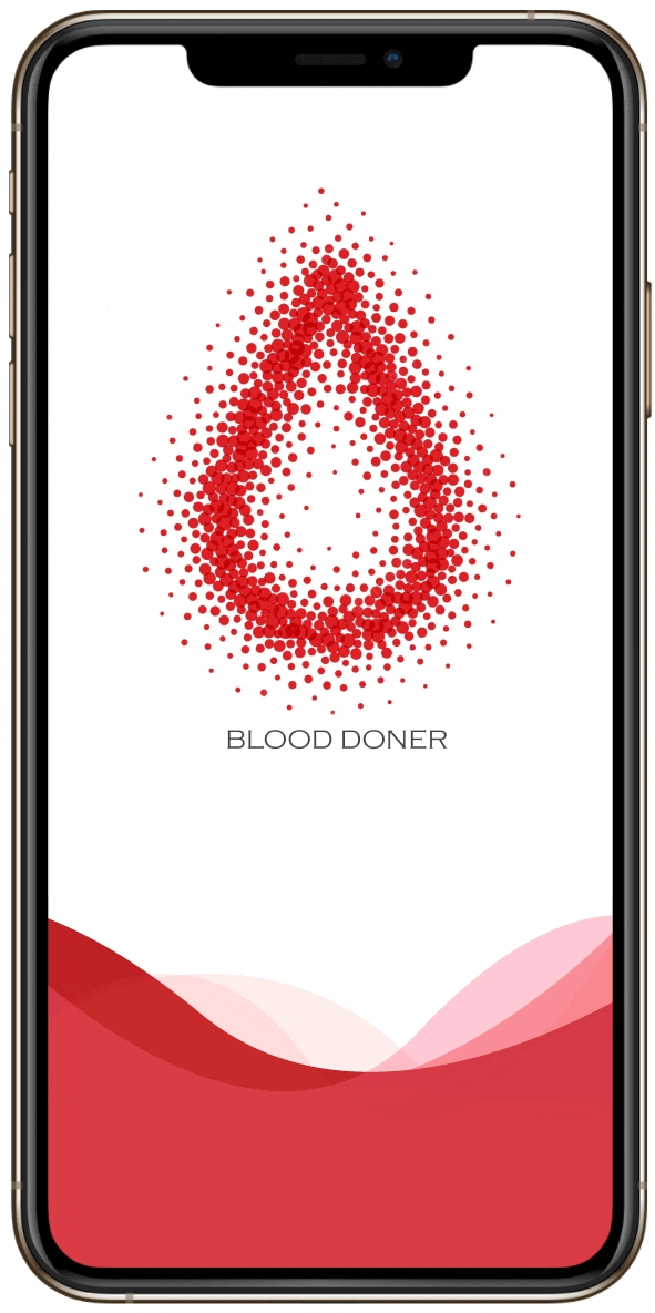
The Blood Donor App puts the power to save lives in the palm of your hand. Donating blood will now be easier than ever.
The problem
many people are looking for blood donations via social media or broadcast messages. The message is asking for help from anyone with a match blood type to donate blood. Most of them need immediate blood transfusions for family or relations. Why isn’t there a platform for connections between patients and donors to make finding blood easier?.
The goal
Design an app that will make it easier for blood donors and patients to connect.
My role
UX designer designing an app for Big Belly restaurant from conception to delivery.
Responsibilities:
Conducting interviews, paper and digital wireframing, low and high-fidelity prototyping, conducting usability studies, accounting for accessibility, and iterating on designs.
Understanding the user
User research: summary
In this research, I want to empathize deeply with users problem and expectation towards blood donation as a recipient and as a donor. So, that I can understand their motivations, frustrations, and exp[ectations. In this case, I chose desk research, Unmoderated usability study, competitive analysis, desk reasearch/interview to doctors and hospital workers

Problem statement:
Jay is a staff at a private company who likes to donate blood every 3-6 months and wishes to have an app that will tell show him a nearby place to donate hid blood

Problem statement:
Kelly is a 27-year-old doctor, The obstacles she faced when her family needed blood made her realize how difficult it is to find a donor, she wants to be ready for next time and she believes an app can help solve the problem.
Competitive audit
I got some knowledge on competitor benchmarking regarding Blood Donation mobile apps. so, I investigated those competitors:

Simply Blood: an app that connects blood donors and blood seekers in real-time, as a blood donor can directly donate blood, and can share blood requests to all potential blood donors within 5kms from the location it's needed.
Reblood: an app that helps blood donors to get information date of last to donate, total donation, the Information placed to the donor, and the information blood donation schedule.
Ayo Donor (PMI): an app that can share a moment of donation, get information placed to the donor, and information blood donation schedule.
Sidoni: an app that gives information on bloodstock in UTD PMI Kab. Tangerang and information events of blood donors around Kab. Tangerang.
Give Blood: an app that connects blood donors and blood seekers to share a story and information about health.
Paper wireframes
I did a quick ideation exercise to come up with ideas for how to address gaps identified in the competitive audit. My focus was specifically on easily finding donors and patients.
Starting the design
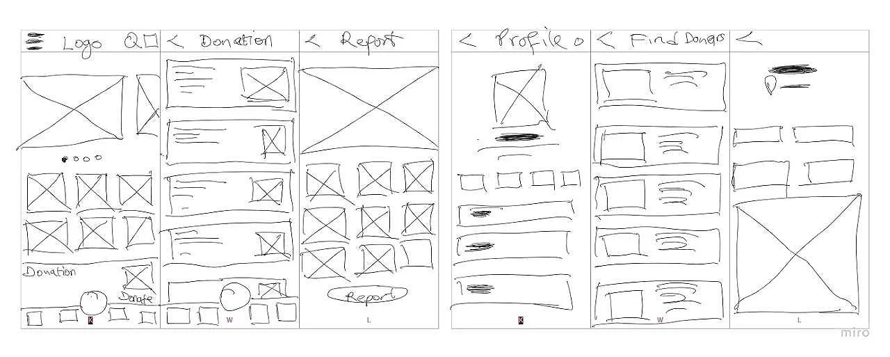
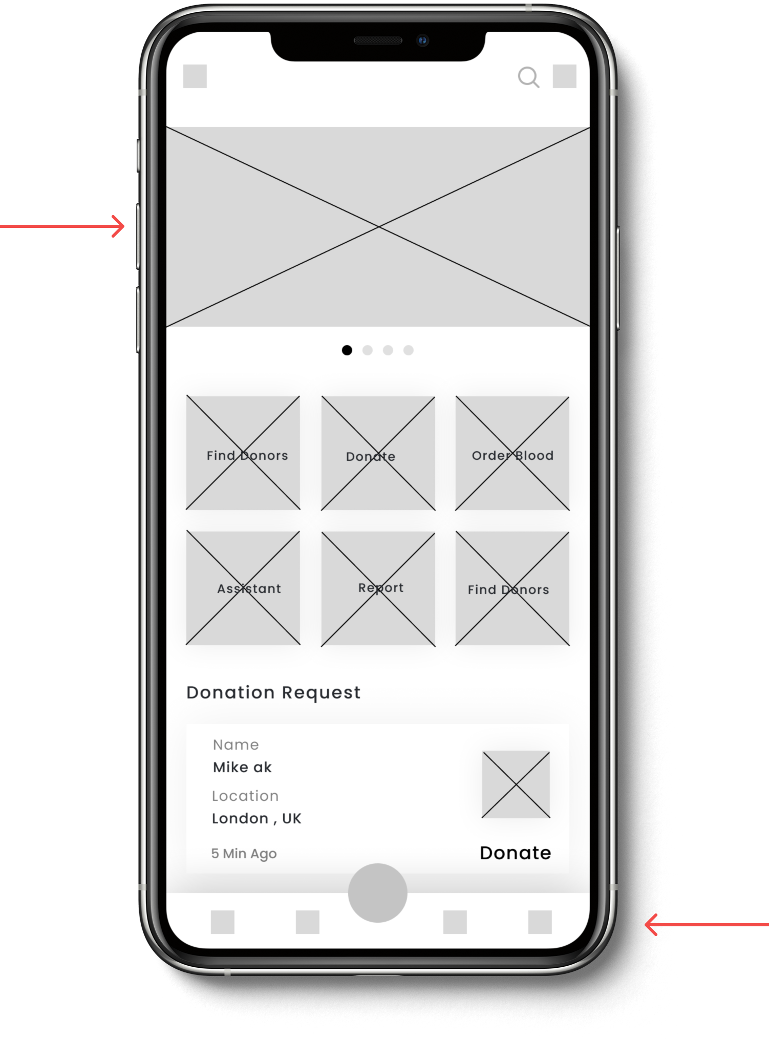
Digital wireframes
After ideating and drafting some paper wireframes, I created the initial designs for the Blood Donation app.
Top half of home shows latest news, recommendations and awareness
Low-fidelity prototype
To prepare for usability testing, I created a low-fidelity prototype that connected the user flow of finding a blood donor and patcient.
View Blood Donor's low-fidelity prototype
Usability study: Perameters
Study type: Unmoderated usability study
Location: United Kingdom, remote
Participants: 7 participants
Length: 30-60 minutes
Usability study as Blood Donors: findings
Users lack information and education about blood donations and need to get information about blood donation places and schedules.
Users only get information on social media.
Health problems become a problem to do blood donation.
Usability study as Recipient: findings
Users need to do it manually to get bloodstocks (ask their relatives, make a campaign on social media, and hospitals.
It’s hard to get bloodstocks because of the unavailability of blood stocks, unmatched blood type, and faraway place to get blood stocks
Usability study as Blood Donors: findings
By going through the survey results and personas, I found that the following are some of the main pain points we can tackle to elevate the whole blood donation experience.
Easy access to app features from global navigation

Refining the design
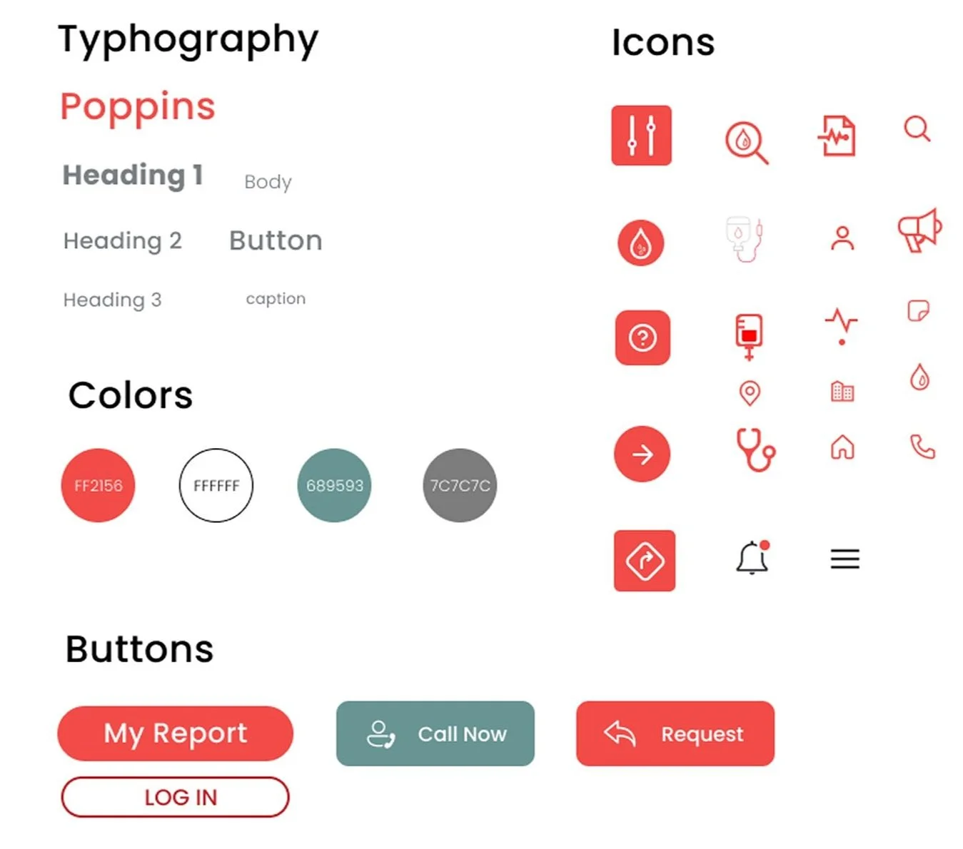
Style guide


Mockups
Based on the insights from the usability studies, I applied design changes like providing a clear section from the home screen that shows the most recent Donation Requests
High-fidelity prototype:
The high-fidelity prototype followed the same user flow as the low-fidelity prototype, including design changes made after the usability study.
View the Blood Donor’s high-fidelity prototype
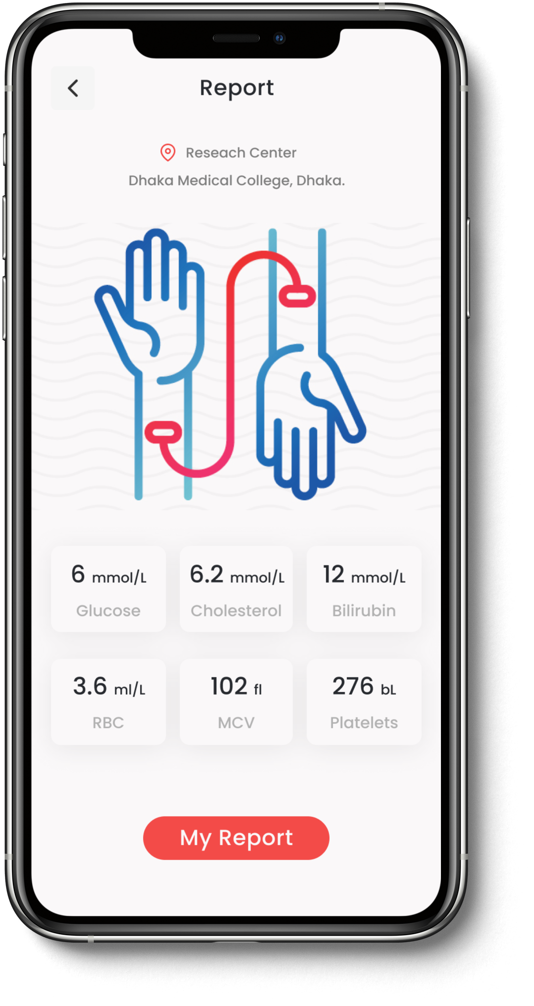
Mockups

Mockups
Additional design changes included adding an option that shows the “Blood type” on the donation request screen.


Responsive design


The designs for screen size variation included mobile, tablet, and desktop. I optimized the designs to fit specific user needs of each device and screen size.
Impact:
Users shared that the app made donating blood easier and fun. One quote from peer feedback was that.
One quote from peer feedback:
“I am sure that this app will help save a lot of lives”
Going forward
What I learned:
I learned that even though the problem I was trying to solve was a big one, diligently going through each step of the design process and aligning with specific user needs, helped me come up with solutions that were both feasible and useful.
Next step:
Conduct research on how successful the app is in finding blood donors and patients.
Add educational resources for users to learn about blood donation.
Provide incentives and rewards to users for successfully donating blood.